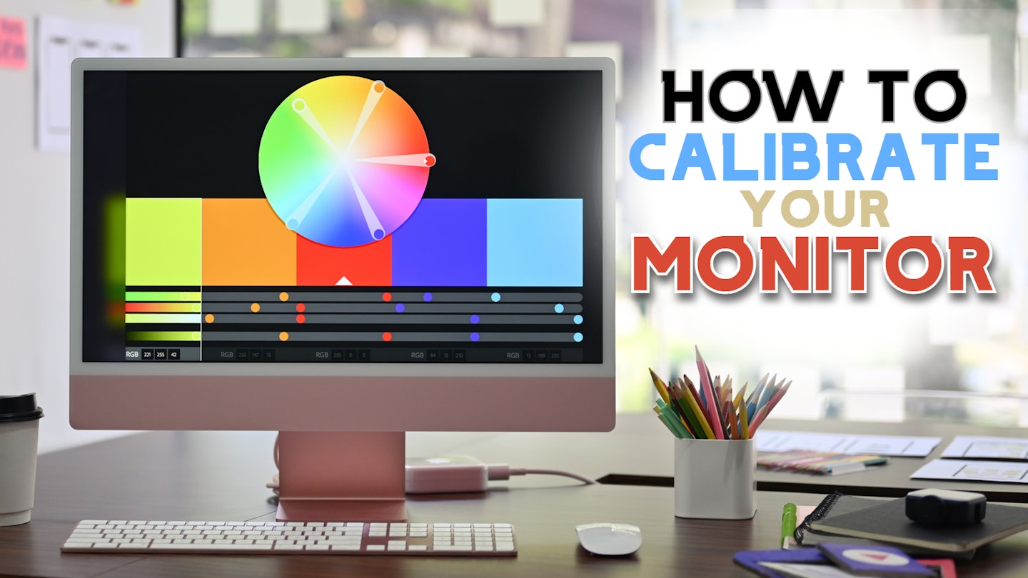
If you’ve noticed that some computer monitors look better than others, it might not be down to price or features – you may need to calibrate your monitor. But surely a brand-new screen is perfect right out of the box? Well, sometimes – but rarely. And that’s because every home computer is slightly different.
The screen leaves the factory with a range of default settings that may satisfy the average user without too many tweaks. But that doesn’t mean it’s been finely tuned to suit you or even the full capabilities of the screen itself – and that's true even with premium 4K monitors.
You might hear the word ‘calibration’ and imagine all sorts of weird and wonderful testing gadgets and specialist colour charts. Both exist, but here we’re looking at using the tools you already have to make your monitor pleasing to the eye. Plus, a couple of websites can help you calibrate even more. By the end of this guide, you’ll have everything you need to get the best out of your computer screens – whether you have a monster of a dual-screen setup or a humble 27-inch monitor. Get ready to enjoy better colours, sharper text, and an improved overall image.
First steps
Warm-up: No matter what monitor you own – be that a budget monitor or the one inside your laptop – get them switched on and warmed up first. A few minutes is all it takes for a modern screen to reach its peak image quality – wait for around 20 if you’re unsure or using an older monitor.
Set the resolution: Next, ensure your computer is set to run the monitor at its native resolution. Most monitors support a range of resolutions, but it will still have one native to its hardware. Selecting this will ensure that there is no extra scaling of the image going on while you calibrate your monitor.
Disable apps: Disable any third-party colour management apps or tools you may have running.
Return to default: Finally, check your monitor’s built-in settings and set it to its defaults. That means removing settings like ‘cool’ or ‘warm’ colour temperature presets and setting things like sharpness to neutral levels. This ensures that any changes you make using the Windows or Mac calibration tools aren’t clashing with the monitor.
How to calibrate your monitor - Windows users
Step one: Search for ‘Calibration’ in the search bar and select Colour Calibration. In Windows 10, this is part of the Control Panel; in Windows 11, it’s a standalone app.
Step two: Follow the on-screen instructions. These will take you through the following steps:
Gamma adjustment
This allows you to balance the screen's red, green and blue light output. This improves colour accuracy and vibrancy.

Brightness and contrast adjustment
This improves blacks and whites in your image, revealing more or less detail in the shadows and highlights.

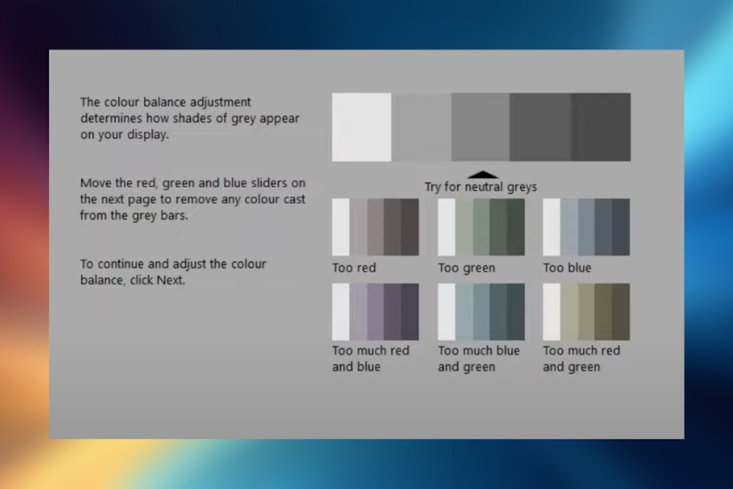
Colour balance
Although this does affect the balance of colours, it’s measured against a neutral range of greys. You ensure your colours are balanced by eliminating a colour cast from the greys.
Text adjustment
Firstly, turning on Cleartype can help with font readability. What follows is a series of screens with blocks of text, and by selecting the ones that look the best to you, you’ll end up with much more readable text.
Step three: At the end of the calibration process, you can compare your changes against the original in a before-after layout. A checkbox at the bottom will prompt you to proceed to the text adjustment stage.
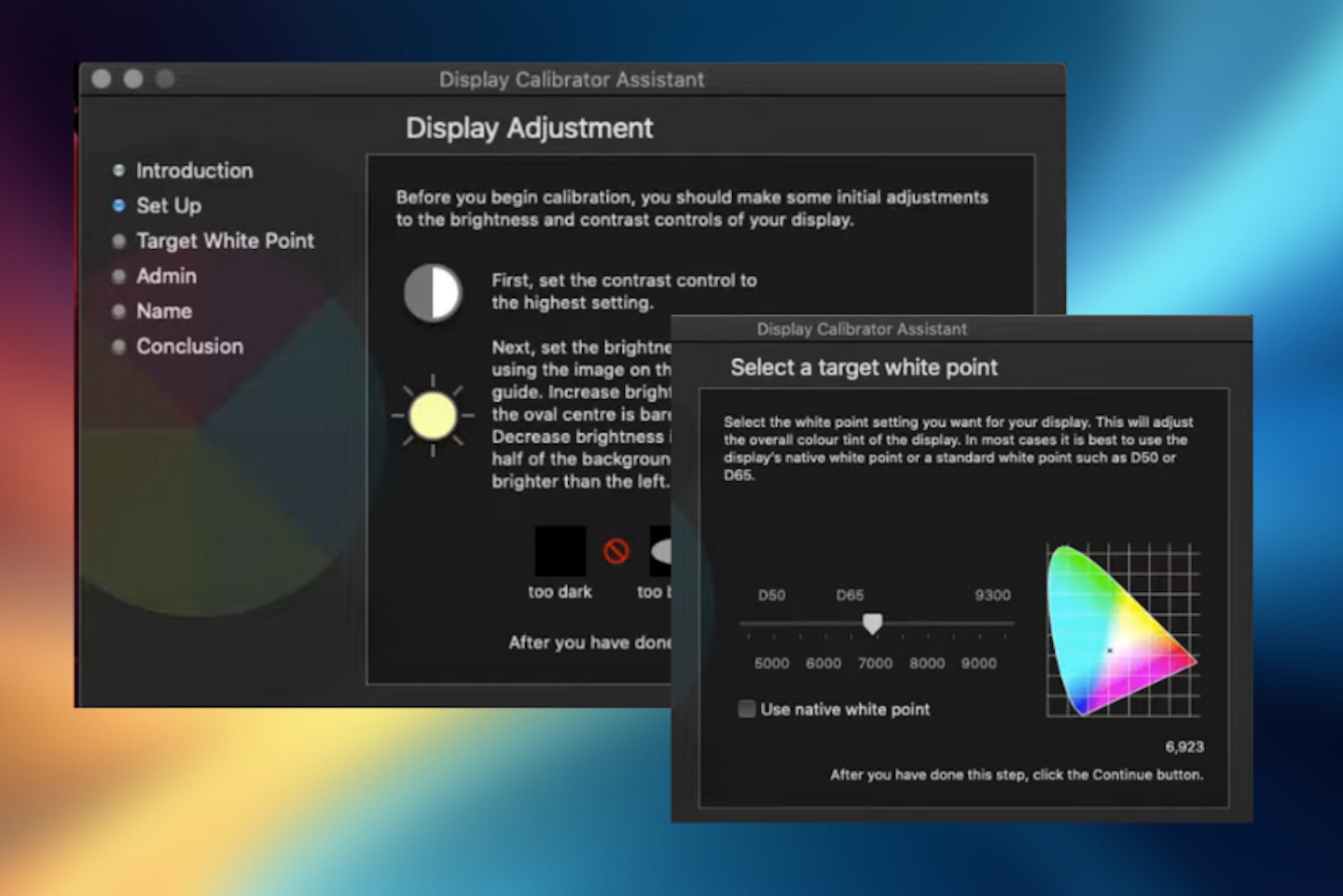
How to calibrate your monitor - Mac users
1. Under the system preferences in the Displays tab, find the Display Calibrator Assistant. It’s also easy to find in Spotlight search.
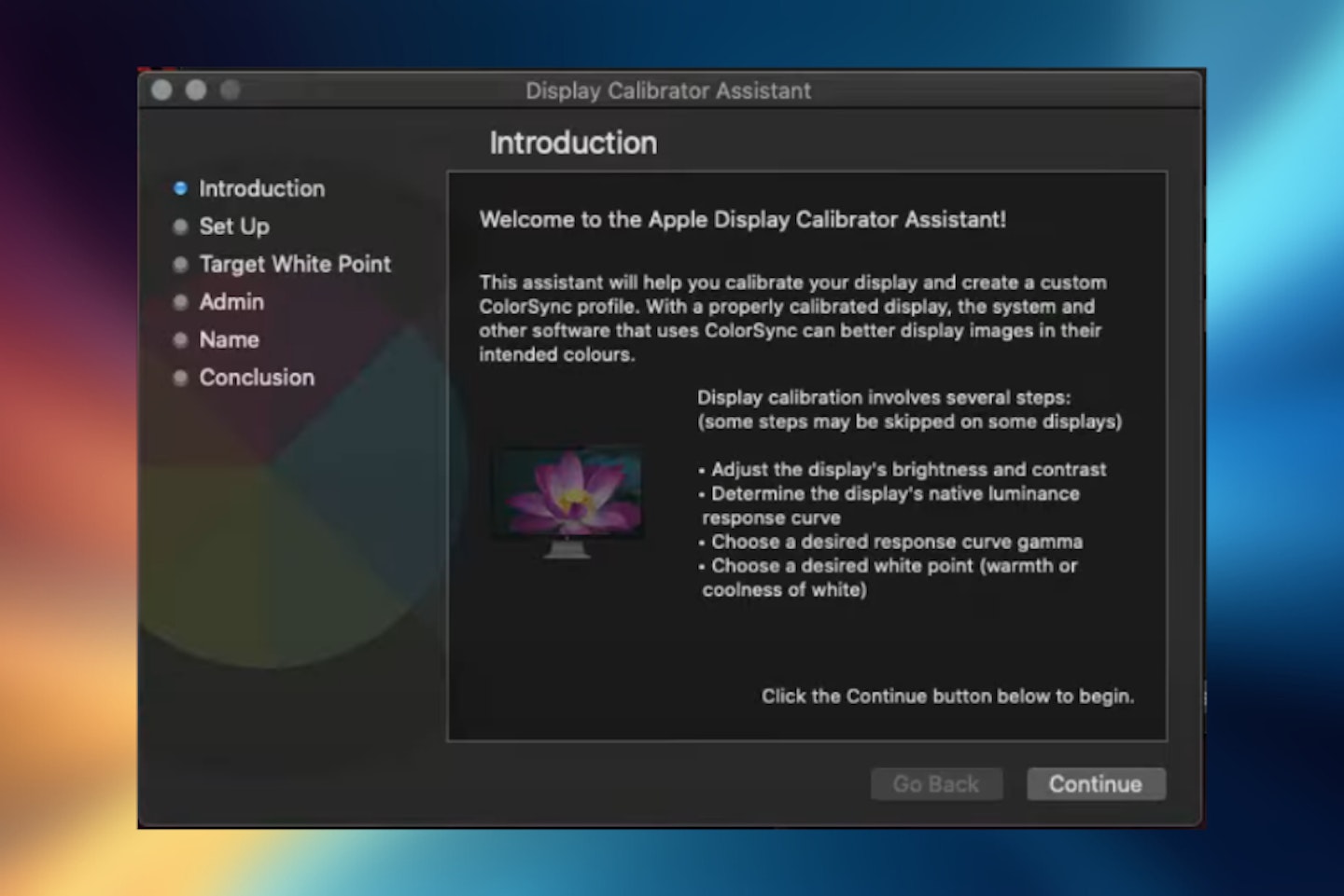
2. Follow the on-screen instructions to alter the following:
White point
This will make your whites pure and free from any colour tint.
Colour adjustments
This will help to adjust colours to be more natural. If you have an Apple display, you may have fewer options here as they’re pre-calibrated, which means you might have more control over a great monitor for your MacBook Pro or other Mac if it's not an Apple product.
3. At the end of the process, you can save your new calibrated settings to a profile for later use.
Refining colour, brightness and contrast
As the intro mentions, professional creatives like photographers and designers can buy specialist monitor calibration tools. These tools are physical sensors that take a look at the screen and use a step-by-step wizard to guide you through each step while you adjust your monitor’s settings. However, they normally cost hundreds of pounds - so what can you do to improve your monitor’s colour settings and more?
Well, thankfully, several free websites can guide you through some of the checks you can do by-eye to tweak and perfect your monitor. These will involve using your monitor’s built-in colour and other settings to make the necessary adjustments.
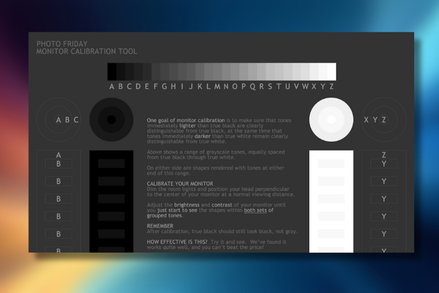
Brightness and contrast calibration: Photo Friday
Photo Friday is a site primarily aimed at photographers. It gives them a reliable way of ensuring their monitor’s brightness and contrast levels are correct - important when processing photographs, particularly when working on details that may otherwise be lost in the shadows.
A simple one-image site with basic instructions, it’s easy to spend a few minutes tweaking your monitor’s levels to get this right.
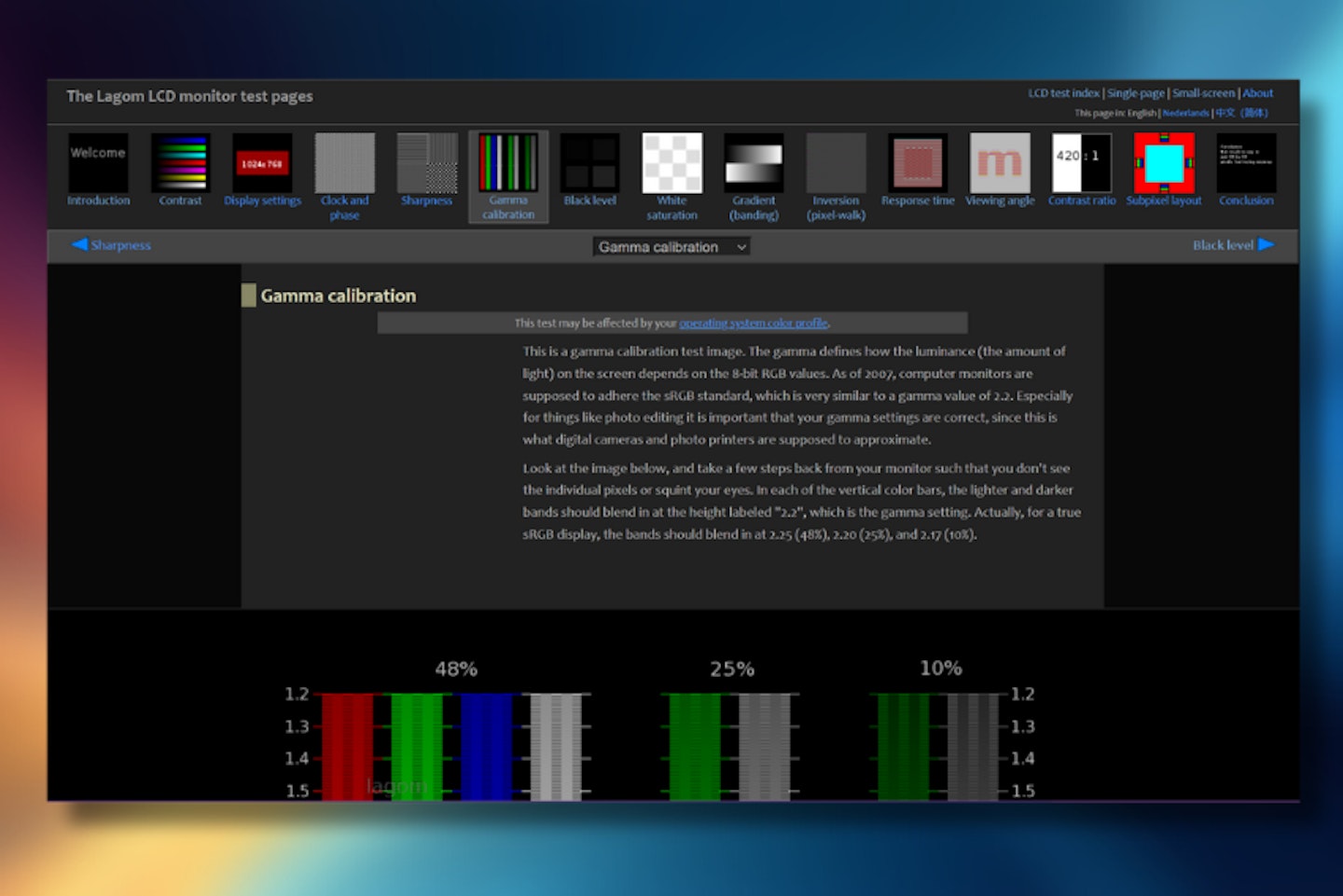
Colour and gamma calibration: Lagom monitor test pages
The Lagom site is yet another easy and accessible tool to help you tweak your colour and gamma settings and more. A clear and concise set of instructions will explain what each test is for. A series of slides will let you use your monitor’s built-in controls and/or your operating system to calibrate each of them - many of which will directly affect your monitor’s colour reproduction. This includes contrast, gamma, black and white levels.
Calibrating your monitor: Top tips
Beware of a monitor's built-in settings
We’re not discussing the essential brightness, contrast and colour levels here. We mean the various extras that can vary from model to model. Settings like sharpness can come in handy for fine-tuning to your taste, but these might be over or under-done out of the box. Other more extreme picture-boosting tech or specialist gaming presets can drastically alter the quality of your image.
These one-button features can alter everything from the gamma levels to contrast, colour temperature and more. They can be great, but often, they can make the image look overcooked. This can range from acceptable to abysmal, from top-of-the-line 32-inch monitors to cheap portable screens, no matter how much a screen costs. Essentially, they’re likely to override your wonderful monitor calibrations and tweaks completely.
Improving colour accuracy is subjective
Remember that colour adjustments here have nothing to do with colour accuracy. Accuracy is a subjective thing that relies on your eyes and other factors. For example, if you’re a creative who needs to print your designs, your printer will have its own colour management and reproduction settings. You’ll need to dive into some practical testing to get your monitor right for your needs. However, the calibration guide here is a great starting point for getting your on-screen colours to match whatever you're creating with your imagery; you'll need to experiment to ensure you like what you see.
How to calibrate your monitor: FAQs
Is it worth calibrating a monitor?
Absolutely. While the difference you’ll see at the end of the calibration might vary depending on your hardware, it’s always worth going through the process for peace of mind. After all, some of the best monitors for photo editing and the like don’t come cheap. So, it’s worth squeezing every bit of clarity out of them that you can. In the worst cases, a budget monitor might come with a default preset that’s either horribly warm or cold in colour temperature. Built-in sharpness or brightness settings could even be at the max. In short, if you look at your monitor and the colours seem unnatural and the fonts a little fuzzy, calibrating your monitor is a must.
What benefits can I get from calibrating a monitor?
As mentioned above, you can end up with sharper, easier-to-read text and on-screen fonts. That could be the difference between eye strain and headaches and a trouble-free workday on an ideal monitor for working from home. Where brightness and contrast are concerned, comfort comes first, but you could end up with much deeper blacks and better highlights on anything from design work to movies.
As for colour, casual designers and professionals could start to rid themselves of the frustration of not seeing the colours they had on-screen having printed their work or shared it with others. For the rest of us, well-calibrated colours mean a more natural image all-round - for entertainment, gaming monitors and more.
Should I use the built-in monitor presets?
Many monitors have a handful of handy presets such as ‘cool/warm mode’ or the sharpness or picture boosting modes we looked at earlier. They can be a handy way to change things if you’re not too fussy, but more often than not you’ll end up with extremes.
We recommend using presets for colour temperature as a starting point for making your own adjustments using the monitor’s built-in menus and settings. It won’t replace proper guided colour calibration, and certainly won’t help where font and clarity features are involved. But, it can give you a simple way of improving things quickly if you need to.
Chris Duffill is a Tech Product Writer for What's The Best. His background includes writing, editorial, marketing, design, video production and photography.
He specialises in home entertainment and audiovisual tech, including speakers, amplifiers, turntables, streaming media players, and TVs. He is also one of our resident experts in computing (PCs, tablets, smartphones, smartwatches), DSLR photography and all kinds of digital cameras. He also writes about retro gaming, game consoles and various electronic gadgets. If it plugs in, lights up or makes a noise, he’ll write about it.
Subscribe to the What’s The Best Newsletter to keep up to date with more of the latest reviews and recommendations from the rest of the What’s The Best team.